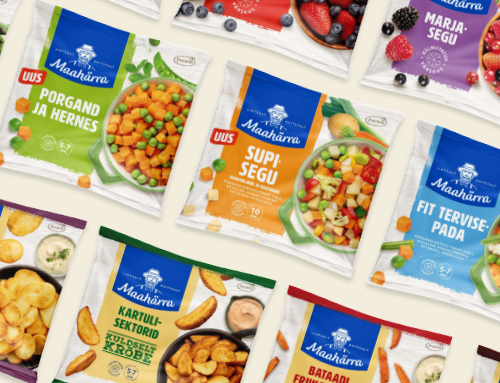
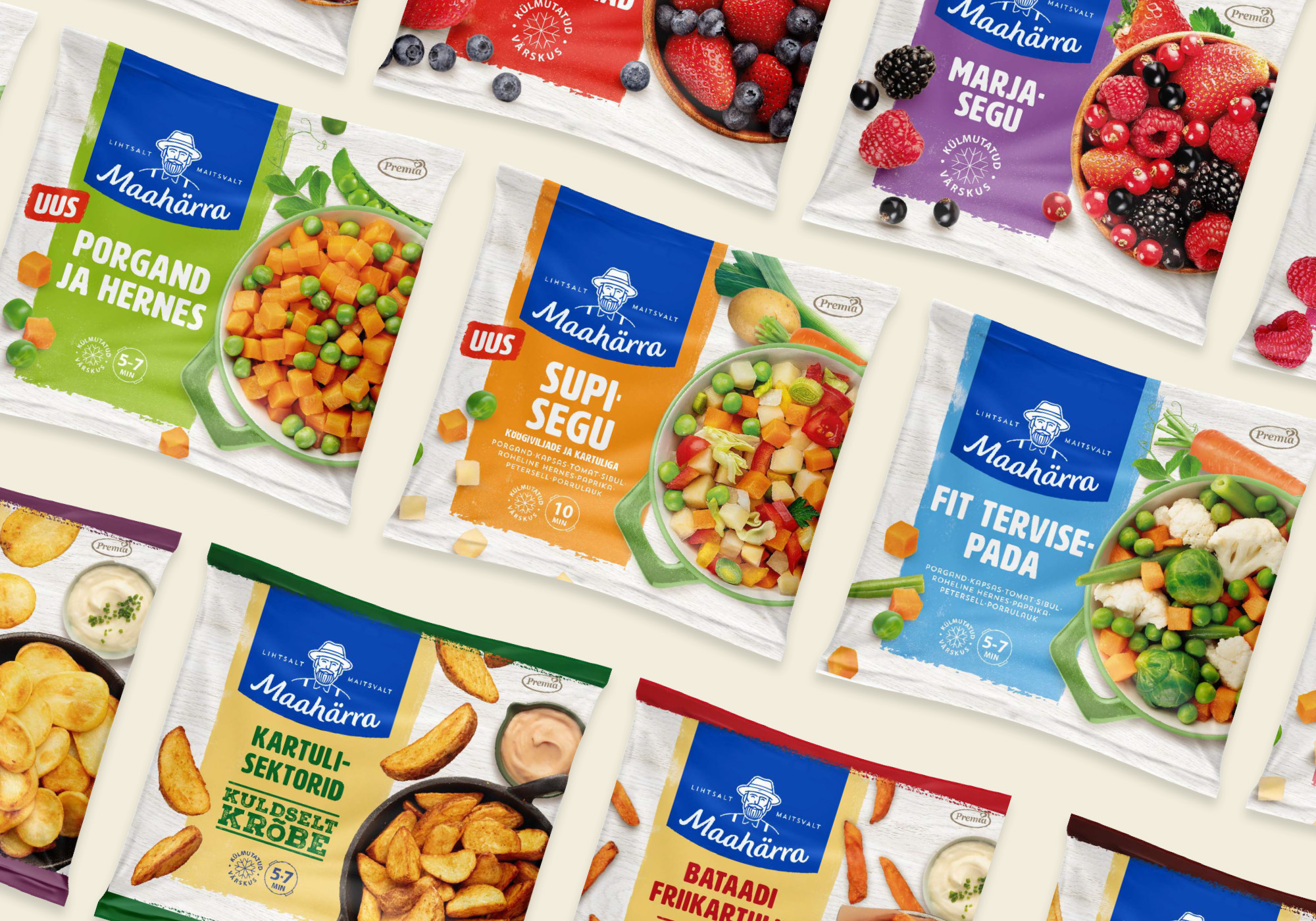
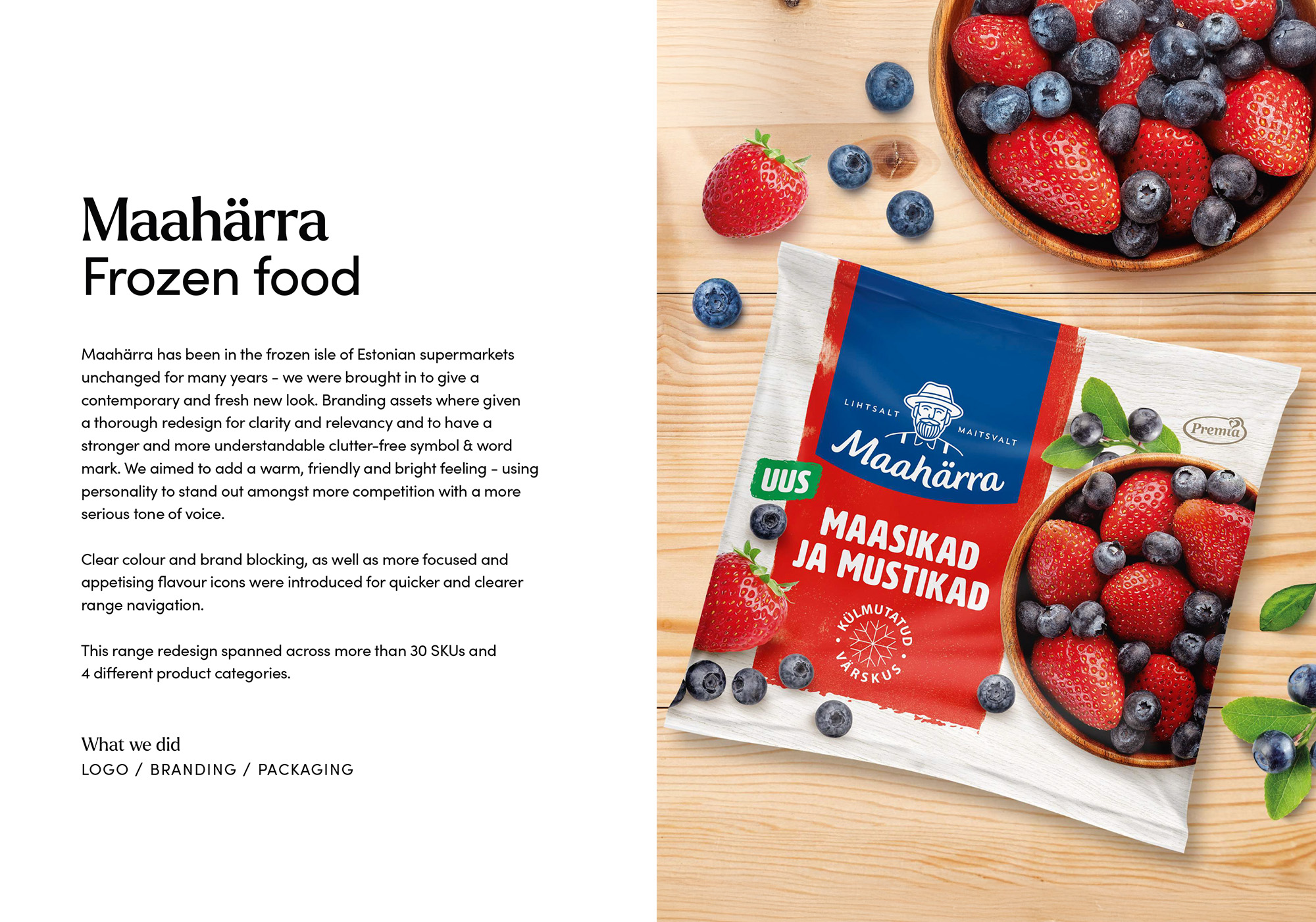
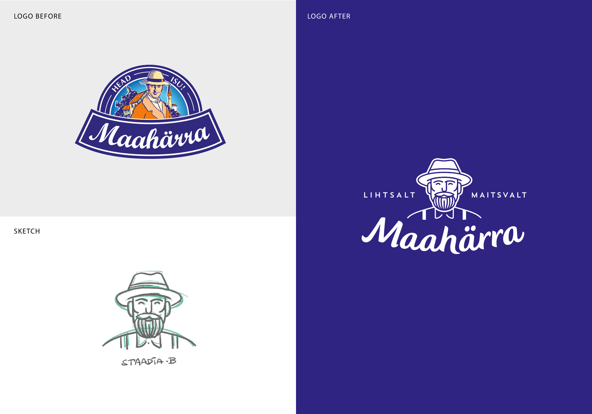
- Maahärra has been in the frozen isle of Estonian supermarkets unchanged for many years – we were brought in to give a contemporary and fresh new look. Branding assets where given a thorough redesign for clarity and relevancy and to have a stronger and more understandable clutter-free symbol & word mark. We aimed to add a warm, friendly and bright feeling – using personality to stand out amongst more competition with a more serious tone of voice.
Clear colour and brand blocking, as well as more focused and appetising flavour icons were introduced for quicker and clearer range navigation.
This range redesign spanned across more than 30 SKUs and 4 different product categories.
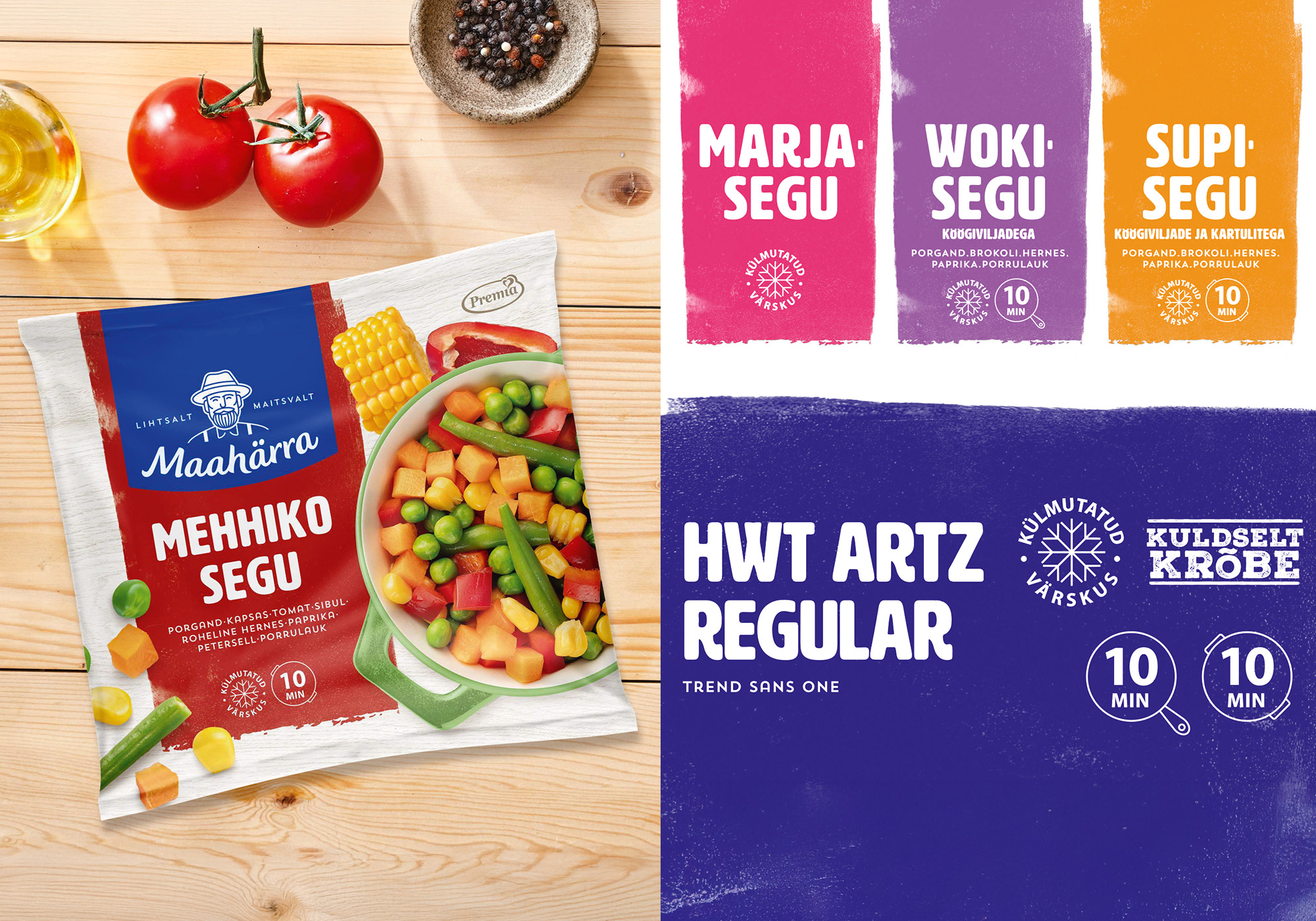
Maahärra rebranding
Packaging Design, Photos and illustrations
Credit24 Pan-Baltic imago campaign
TVC
Manufaktuuri Vabrik Brand & Visuals
Digital, Photos and illustrations, Print, Social Media
Logo and visual identity for KUU
Design / Logo
Avita TVC 2024
TVC, Video / Film
Pealinna new dumplings
Packaging Design
Soupjective campaign
Campaign, Digital
Off to Legoland with Põnn
Campaign, Digital, TVC, Video / Film
Valio cream cheese
Campaign, Digital, TVC, Video / Film
Maxima Hinnaliider
Campaign, Print, Social Media, TVC, Video / Film