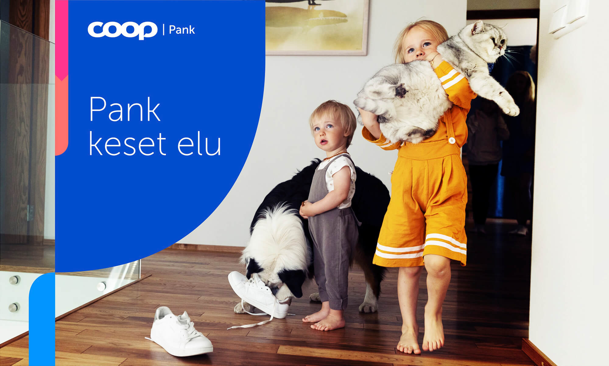
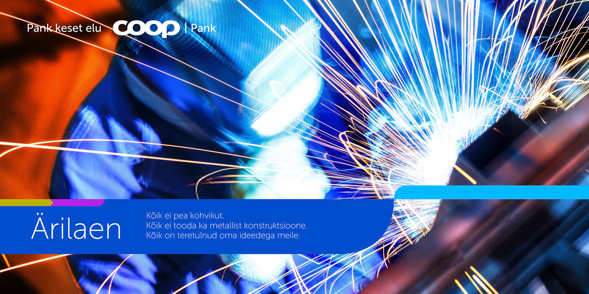
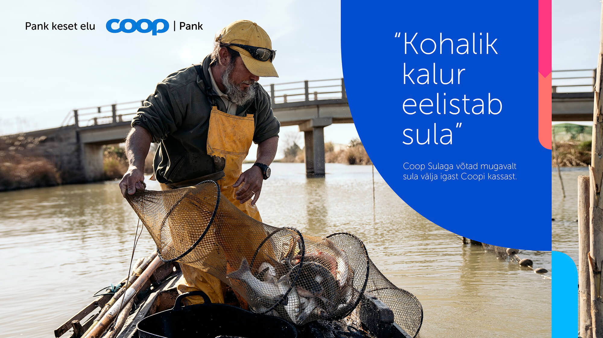
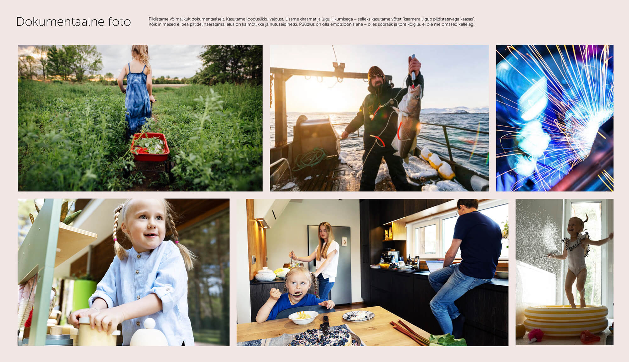
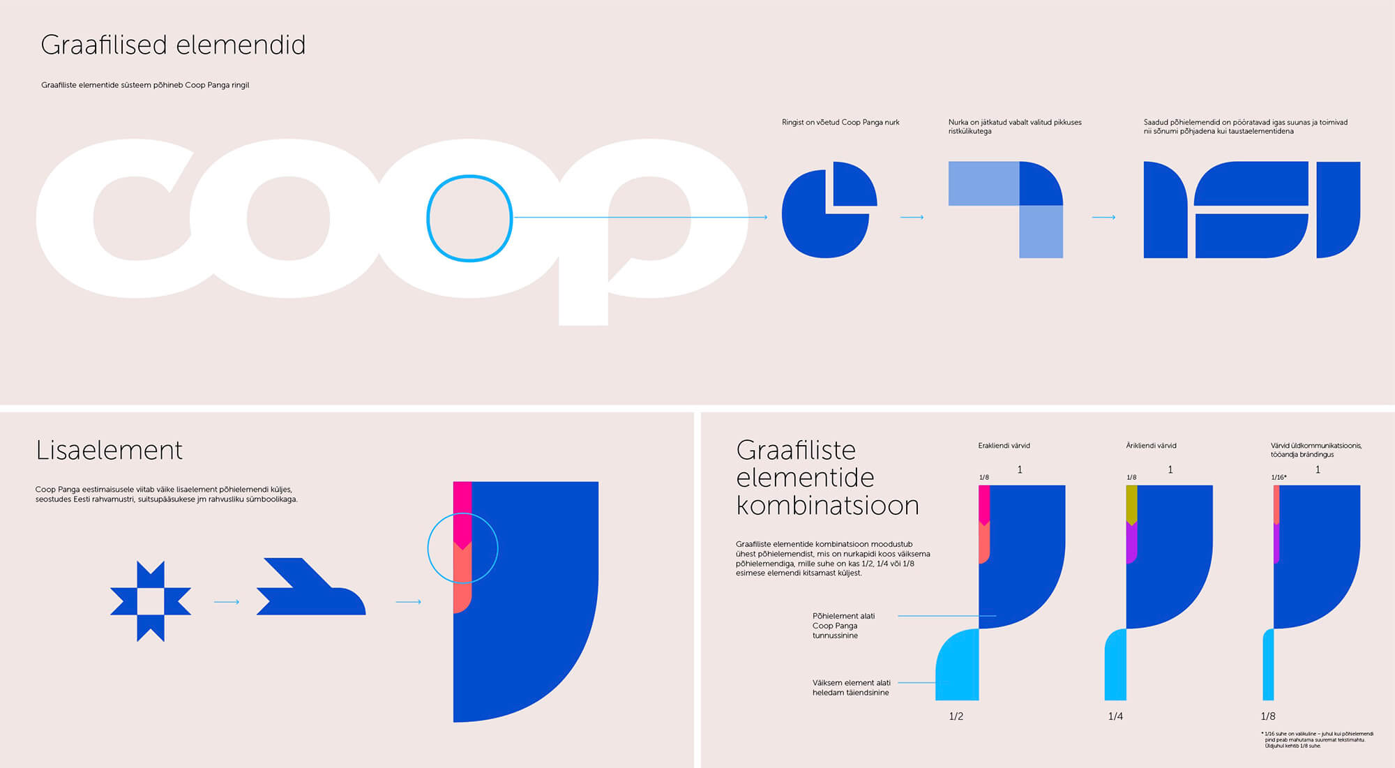
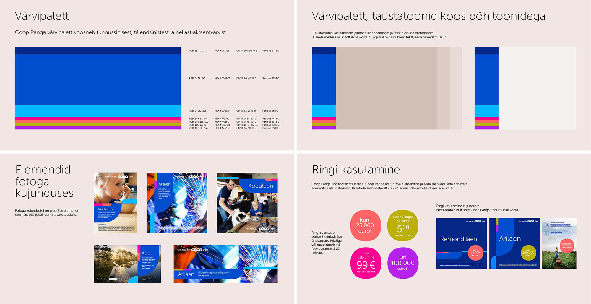
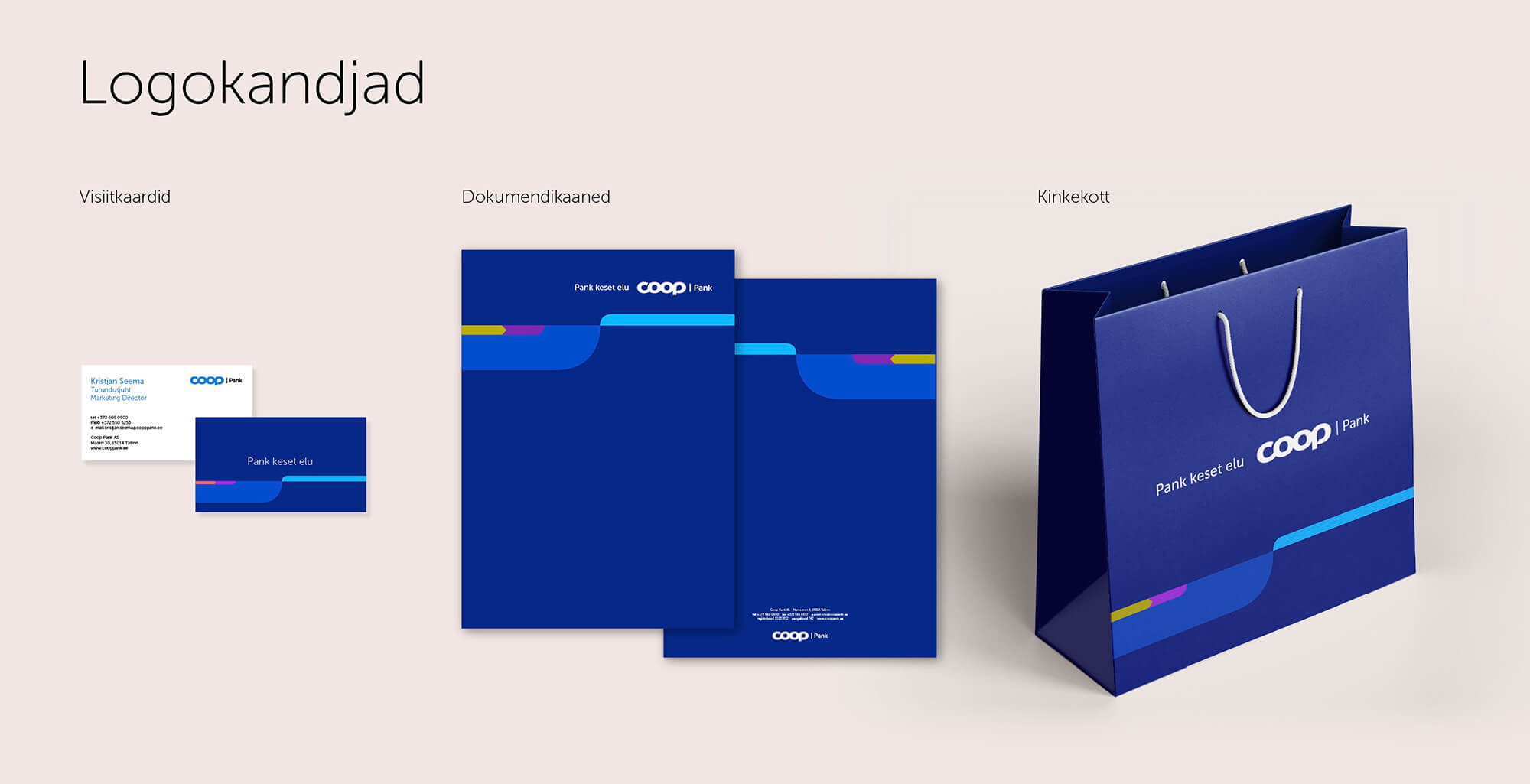
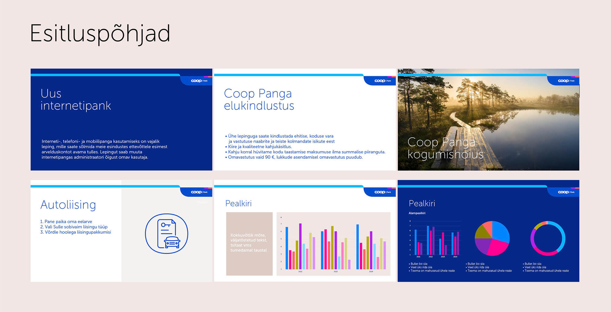
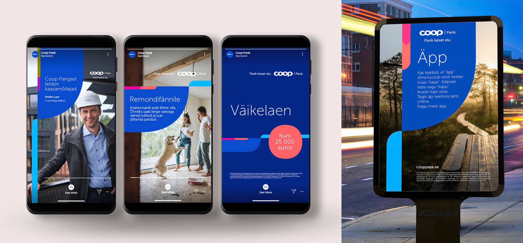
We brought energy, colour, Estonian essence and modernity into a graphic language and we made the visual language more documentary and lifelike. The authenticity is also created by humorously worded messages in a quotation style, which communicate the product while reflecting the everyday life of the consumer. Why all this? Coop Pank wants to be more bank-like, so through rebranding, we made the advertising language more credible and visually attractive.

Maahärra rebranding
Packaging Design, Photos and illustrations
Credit24 Pan-Baltic imago campaign
TVC
Manufaktuuri Vabrik Brand & Visuals
Digital, Photos and illustrations, Print, Social Media
Logo and visual identity for KUU
Design / Logo
Avita TVC 2024
TVC, Video / Film
Pealinna new dumplings
Packaging Design
Soupjective campaign
Campaign, Digital
Off to Legoland with Põnn
Campaign, Digital, TVC, Video / Film
Valio cream cheese
Campaign, Digital, TVC, Video / Film
Maxima Hinnaliider
Campaign, Print, Social Media, TVC, Video / Film